
Study — Why the Growth × Inflation Quadrant Doesn't Sort Returns
The obvious grid for reading markets is growth × inflation. We tested it seriously, over a century and a half and 47 countries. Verdict: it's persistent, but it doesn't robustly explain returns. Here's the proof — and what we read instead.
1. The question, and the hypothesis we set out to break
Before building a regime reading, one question comes first: does the growth × inflation grid — the one behind every classic framework — actually sort how assets behave, in a stable way and beyond the United States? A claim like that can be tested, and tested in order to be refuted.
An economy's position on two binary axes: growth above/below its trend, inflation above/below its own. Four states: disinflationary expansion ("goldilocks"), overheating, stagflation, disinflationary slowdown. This is the grid we put to the test here — not the one the product ultimately keeps.
The strong hypothesis to break: returns differ significantly from one quadrant to the next, robustly. If it falls, the grid doesn't deserve to be the reference regime.
2. Data and sources
Two families, never mixed in a single statistic, each with its own depth:
| Data | Depth | Nature | Source |
|---|---|---|---|
| US equities (total return) | 1871 | academic | Robert Shiller (Yale) |
| 10 US sectors (TR, value-weighted) | 1926 | academic | Kenneth R. French (Dartmouth) |
| US 3-month T-bill rate | 1934 | public domain | Federal Reserve (H.15) |
| WTI crude oil | 1946 | public domain | U.S. EIA |
| US 10-year sovereign rate | 1962 | public domain | U.S. Treasury |
| US inflation — CPI | 1947 | public domain | U.S. BLS |
| Gold price USD | effective 1960+ | study series | Cap Nord calculations |
| Real residential property prices | 1971, 53 countries | internal pipeline | Cap Nord |
| Equities, 10-year rates, FX, macro by country | variable | internal pipeline | Cap Nord |
Licensing rule: no third-party series is reproduced — only the statistics we derive from them appear, with attribution.
3. Method
Classifying a regime honestly means first making it persistent. The naive "sign(value − moving average)" rule flickers: even with a ten-year average, it produces three- or four-month episodes, because the value re-crosses its average near the line. That's not a state, it's a high-frequency crossing. We correct it with hysteresis: we only switch when the gap to the trend exceeds a threshold in standard deviations. Sweeping every window × threshold combination across three independent bases, the best discrete split emerges: institutional (real GDP × CPI), 13-year mean, 1σ threshold — episodes of about three years, stable from one base to the next.
Measuring discrimination comes next: for each asset, we test whether returns differ between regimes (Kruskal-Wallis, non-parametric), and on what share of countries it's significant. Everything exists in two versions, nominal and real (deflated by inflation) — real is the purchasing-power reading, the one that lifts the monetary illusion of inflationary regimes.
4. What we see first — and why to distrust it
On first reading, the grid seems to work. In the United States, each quadrant has its own profile: gold rides high-inflation regimes better, defensive sectors hold, broad equities suffer — all the more in real terms, once inflation is stripped out. And across nearly all 47 countries, the worst regime falls in the inflationary pair, overheating or stagflation. Enough to conclude, too quickly, that the grid sorts returns.
These figures are real — they're observed conditional averages. But a conditional average is not proof of robust discrimination. Within a three-year episode, the months are strongly correlated with one another: the number of independent observations isn't the number of months, but the number of episodes. A test that ignores this massively overstates significance.
5. The decisive test — and the invalidation
We put the grid through three adversarial tests, accepted even if they invalidate it.
Rotation test (significance robust to autocorrelation). The idea is simple: we reshuffle the regime labels through time — fabricating hundreds of fake splits by shifting the real labels — and check that the real regime separates returns better than these fakes. If a regime lasts three years, its thirty-six months aren't thirty-six independent pieces of proof; this test accounts for that, the naive one doesn't.
| Asset | Significant (naive test) | Significant (rotation test) |
|---|---|---|
| Bonds | 92% | 27% (median not significant, p 0.14) |
| Equities | 4% | 10% |
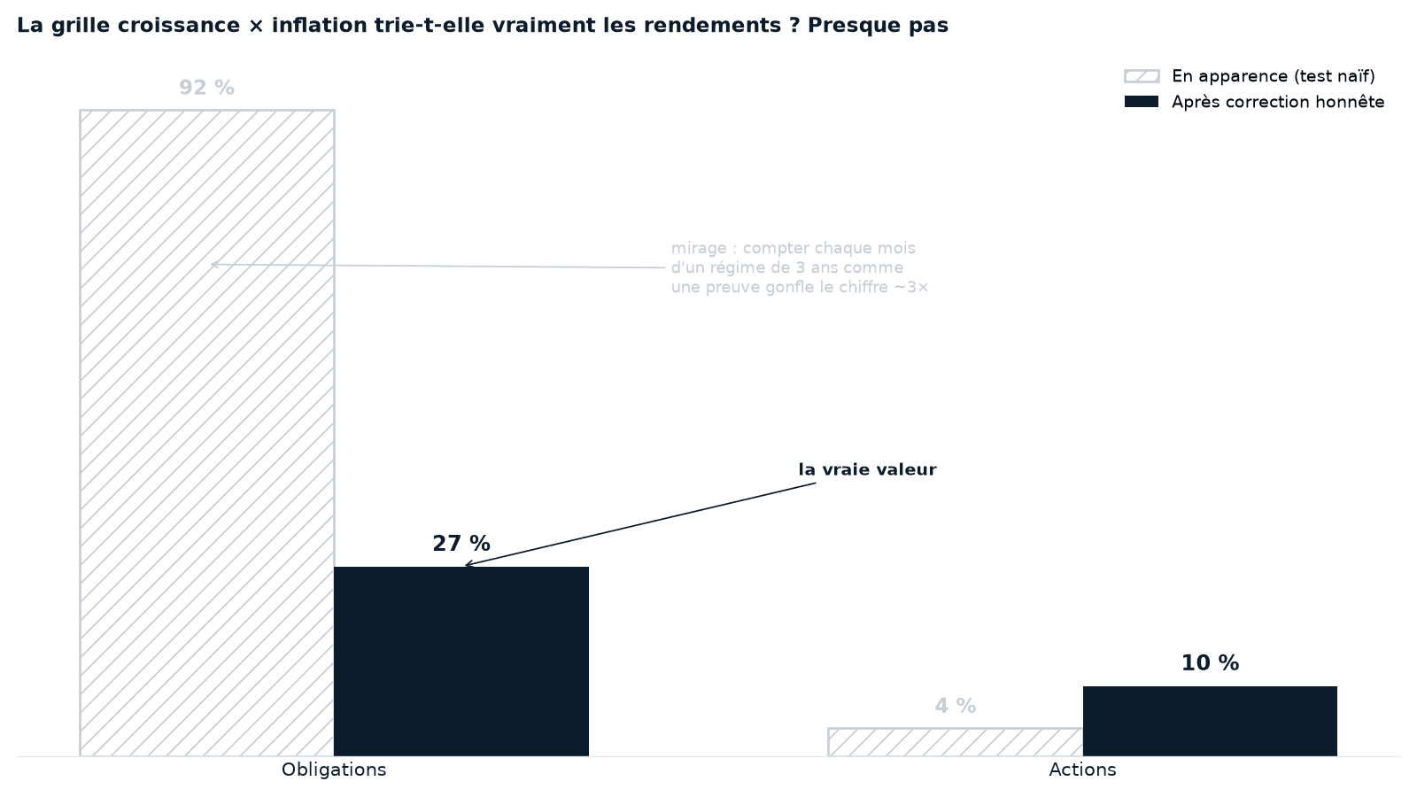
The bond significance claimed (94% on the full universe, 92% on this base) was inflated roughly threefold by autocorrelation. Under the honest test, 27% of countries stay significant and the median doesn't. The signal is real but weak — not the massive result the first reading suggested.
Discrete regime versus continuous factors. Cutting into four cells loses information relative to the two continuous variables — the growth and inflation deviations kept as numbers, rather than filed into drawers. The share of variation explained (the R²) is lower in quadrants than in continuous form: 0.032 versus 0.057 for bonds, 0.010 versus 0.012 for equities. And in every case it stays tiny — on the order of 3 to 5% for bonds, 1% for equities.
Independent crosscheck. An inferred regime-switching model (Markov-switching, unsupervised) confirms the persistence (~1.5-2.3 years, the same order as our 3 years) but brings the unbiased bond discrimination down to 65%, against 94% for our optimized classifier. The link exists; its claimed magnitude was overstated.
Finally, macro isn't point-in-time: GDP is heavily revised after the fact. Using a real-time GDP × CPI regime introduces look-ahead bias.
6. What survives, and what we read instead
The strong version — "the growth × inflation quadrant powerfully sorts returns" — isn't supported. What's left after the test:
- The regime is persistent (~3 years) — but that's a property of macro, not an exploitable edge.
- A macro → bonds link, real but weak, better captured in continuous form than in cells, and dominated by inflation (inflation alone already explains most of it; the bond is duration).
- Nothing robust for equities: macro doesn't sort equities.
Hence the reading the product keeps — derived from the data, not imposed:
- The real rate (long rate minus inflation) sorts the defensive holdings and predicts bonds out of sample.
- The market trend (price against its long average, bull/bear) governs equities, which macro doesn't sort.
That's the subject of Macro regimes: reading the asset matrix. The growth × inflation quadrant, for its part, stays documented as a first pass — not as the reading grammar.
7. Two observations that do hold (descriptive)
Regardless of the grid's fate, two behaviors come out cleanly from the decompositions and deserve noting — as observed facts, not as signals.
- Outside the United States, the penalty of inflationary regimes runs first through the currency. Split each dollar return between local market and exchange rate, and the nominal local market holds up just about everywhere; it's the currency that turns a mediocre return into a negative one. The exception is American: when US inflation rises, the dollar doesn't take the penalty other currencies do — the reserve-currency privilege.
- In real terms, the nominal lies. The bond "carry" of the 1970s evaporates once inflation is stripped out; equities, positive in current dollars, turn negative in purchasing power. Only gold stays firmly positive in real terms in these regimes. That's why everything reads in real terms.
8. Limits and statistical honesty
- Each cell carries its own sample size; below the threshold it's marked insufficient — nothing is imputed, an empty cell shows "not observed".
- The multi-country market base is recent (2018+), so largely a single big episode (2022) lived by all at once: concordance there mixes synchronization with independent experiences.
- Assumed approximations: bond total return rebuilt from rates; academic industries ≈ modern sectors; funds at net asset value net of fees.
- No causality, no forecast: the study describes conditional historical behavior and the — weak — explanatory power of a split.
Risques
Performance
Conditional historical behavior — no expected performance, no signal.
Volatilité
Measured by regime for description, never projected.
Max drawdown
Computed on the worst contiguous episode of a regime, never by splicing eras.
This study is descriptive and educational. A future regime may differ from past ones. No figure constitutes a recommendation, a rating, or a promise of performance.
Takeaways
- The growth × inflation quadrant is persistent (~3 years), but it doesn't robustly discriminate returns.
- Naive significance (94% for bonds) is an autocorrelation artifact: the rotation test brings it down to 27%, median not significant.
- Cutting into four cells loses information against continuous factors; macro doesn't sort equities.
- What we read instead, derived from the data: the real rate for bonds, the market trend for equities.
- What holds, descriptively: the inflationary penalty runs through the currency, and the nominal lies — everything reads in real terms.
Go further
- Macro regimes: reading the asset matrix — the axes we keep, real rate × trend.
- Why the classic grid falls short — the short version of this verdict.
- The Cap Nord method — reading the markets without predicting them.
Public series: U.S. Treasury, Federal Reserve (H.15), U.S. Bureau of Labor Statistics (CPI), U.S. Energy Information Administration. Academic data: Robert Shiller (Yale, US equities since 1871), Kenneth R. French (Dartmouth, industry portfolios since 1926). Gold price, UCITS ETF net asset values, sovereign rates, exchange rates and property prices: Cap Nord / internal pipeline. All figures are derived statistics computed by Cap Nord (regime-conditioned returns, in USD, significance tests robust to autocorrelation); no third-party raw series is reproduced. Descriptive and historical — the past does not prejudge the future.