
Inflation, Growth and Macro Regimes: Why the Classic Grid Falls Short
The most common reading splits the economy into four regimes by two forces: inflation and growth. It's intuitive, and it isn't absurd. But put it to the data and this grid doesn't sort what it claims to sort. Here's the classic grid, the exact spot where it cracks, and the reading we keep instead. Descriptive — not advice.
The classic grid (the one everyone learns)
The starting idea is appealing: before looking at an asset, you place the economy on two axes.
The currency's loss of purchasing power over time. At 2% inflation, €100 today is "worth" about €98 of purchasing power a year from now.
An economy's capacity to produce more value — measured mainly by GDP.
Cross the two and you get four cells, popularized by so-called "all-weather" approaches:
| Inflation | Growth | Regime |
|---|---|---|
| low | strong | Disinflationary boom |
| high | strong | Inflationary boom |
| high | weak | Stagflation |
| low | weak | Disinflationary recession |
Each cell is meant to favor certain assets: equities in the boom, gold in inflation, bonds in recession. Clean, memorable. Too much so, maybe.
Where the grid cracks
A grid is only worth something if it holds under test. So we ran the exercise: do these four cells, derived from inflation and growth, actually sort how assets behave?
The answer is uncomfortable. Imposed in advance, the growth × inflation grid loses most of its sorting power the moment you confront it with the long history. In particular:
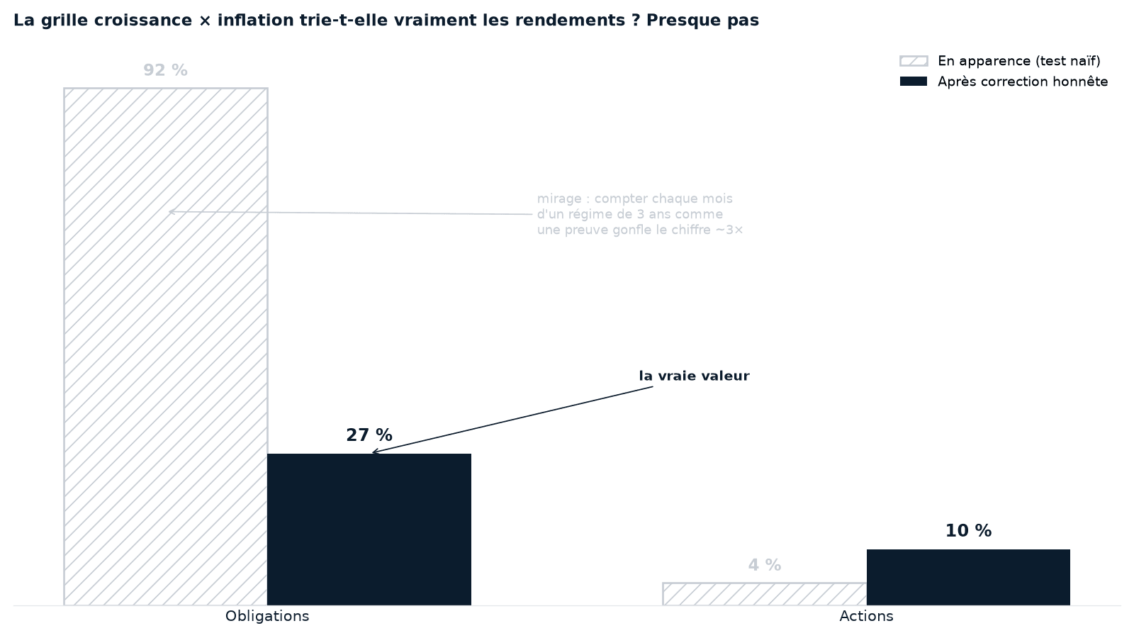
The naive test counted every month of a three-year episode as an independent piece of proof; there were about thirty-six times fewer than it looked. Once autocorrelation is corrected, bond significance melts by two-thirds — from 92% to 27% of countries — and the median is no longer significant. The grid held up partly on a counting illusion.
Concretely: knowing whether we were in a "boom" or a "recession" barely helps say whether equities were going to rise — their trend does. Put differently, the "boom = equities, recession = bonds" cell assumes what it ought to demonstrate. Equities follow their trend far more than any macro quadrant. And what really separates the defensive assets (the ones meant to protect: gold, bonds, cash) isn't the growth/inflation pair — it's above all a deeper quantity: the real rate (read against its long trend, not its raw level).
A grid laid over reality reassures. But reassuring isn't sorting.
What we read instead
Rather than impose four cells, we let reality speak:
- Equities read by the trend: is their price above or below its average of the last few months? Above = carried, below = broken. No macro needed.
- The defensive holdings read by the real rate: when it's low, gold is favored; when it's high, cash dominates the defensives.
- Regimes aren't decreed, they're kept because they hold under test.
The interest rate once inflation is stripped out — what money truly earns. When it's negative, holding cash loses purchasing power; it's the pivot between gold and the rest.
This reading is detailed in the Cap Nord method. The essential point: we don't predict a regime from macro figures published late — we read the current regime in prices (gold, equities, bonds).
Why the classic grid survives anyway
If it sorts poorly, why is it everywhere? Because it's cognitively comfortable: a simple cause, four cells, a story that hangs together after the fact. That's exactly the kind of narrative the mind prefers — and the kind Cap Nord works to avoid. The grid isn't useless as vocabulary ("stagflation" describes a real thing well); it's misleading as a machine for sorting assets.
Limits of this reading
- CPI and GDP are published late and revised: they explain the past, they don't predict.
- No reading removes uncertainty; transitions are gradual and ambiguous.
- Historical behavior by regime guarantees nothing for the future.
Takeaways
- The classic grid splits the economy into 4 regimes by inflation and growth
- Under test, it sorts neither equities (which read by the trend) nor really the defensives (which the real rate separates)
- "Stagflation" stays a useful word; the quadrant stays a poor sorting tool
- We prefer to let reality draw its own regimes rather than lay a ready-made grid over it
- A descriptive, historical reading — never a forecast or advice
Go further
- The Cap Nord method — how we read the markets without predicting them.
- Volatility is not risk — why enduring beats predicting.
Explore the regime map
The chart: quadrant discrimination test (real GDP × CPI) on returns by country, long universe; "rotation test" = significance corrected for the autocorrelation of episodes (we reshuffle the regime labels to check that the real split separates better than fakes). Detail in the full study. Reading derived by induction from public macroeconomic and financial data (World Bank indicators, BIS, statistical institutes) transformed by the internal pipeline. Historical and descriptive results; the past does not prejudge the future.